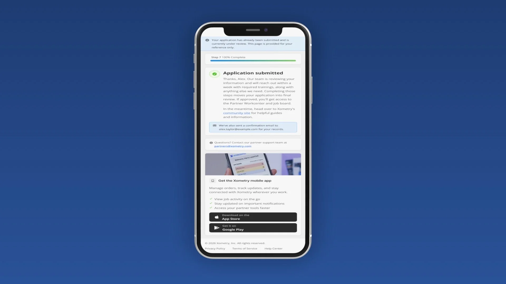
A responsive post-registration landing page that confirms a partner's application the instant they hit submit, sets clear expectations for what's next, and routes them into the Workcenter app — no approval phone call required.
Onboarding that doesn't keep partners waiting.
XOMETRY · PARTNER EXPERIENCE
01 — OVERVIEW
The moment right after "Submit."
For Xometry's Partner Experience team, I designed the post-registration landing page shown the instant a partner submits — confirming receipt, mapping the path ahead (email, approval review, training), and routing them into the Workcenter app.
02 — THE PROBLEM
Partners hit submit — then waited on a phone call.
After registration, partners had no confirmation their application went through — approval depended on Xometry calling them back. That manual step stalled onboarding and left partners unsure whether to act or wait, at the exact moment momentum mattered most.
One screen that answers "what happens next?"
03 — THE SOLUTION
Designed around six goals
We ended the approval call.
04 — OUTCOMES
The manual approval phone call is gone. Partners get an immediate, self-serve confirmation instead of waiting for Xometry to reach out.
A single, well-sequenced next-steps screen removes the limbo between applying and being reviewed, keeping onboarding moving.
With friction removed at the critical moment, more partners make it through onboarding instead of stalling after registration.
What I owned on this project.
05 — MY ROLE